DC ComicsLogo Redesign
Oh, hello ultimate childhood dream project.
I’ve been reading comics all my life, and, while I can’t claim total allegiance to any one publisher, DC makes up a healthy portion of my long boxes. So when Emily Oberman and her team at Pentagram invited me to strategize on a redesign for the DC Comics logo, I said “shut up.” And then I said, “yes.”
My work on this project consisted of co-interviewing executives and creatives at Warner Bros. and DC Comics to get a sense of where they’d been and where they’d like to go with a rebrand. I then took that information, alongside copious research [reading comics], and developed a strategic foundation and narrative for a big change across numerous divisions, platforms, and industries.
WB and DC were lovely to work with and I got the chance to speak with some names I’ve been reading on covers and editorial headers for years and years. Ultimately, I helped construct the stories and rationale for the heroic work that Emily and her designers accomplished. It naturally didn’t take too much convincing on my part. I’m excited to watch this logo evolve and take up its mantle as an iconic element of an iconic brand.
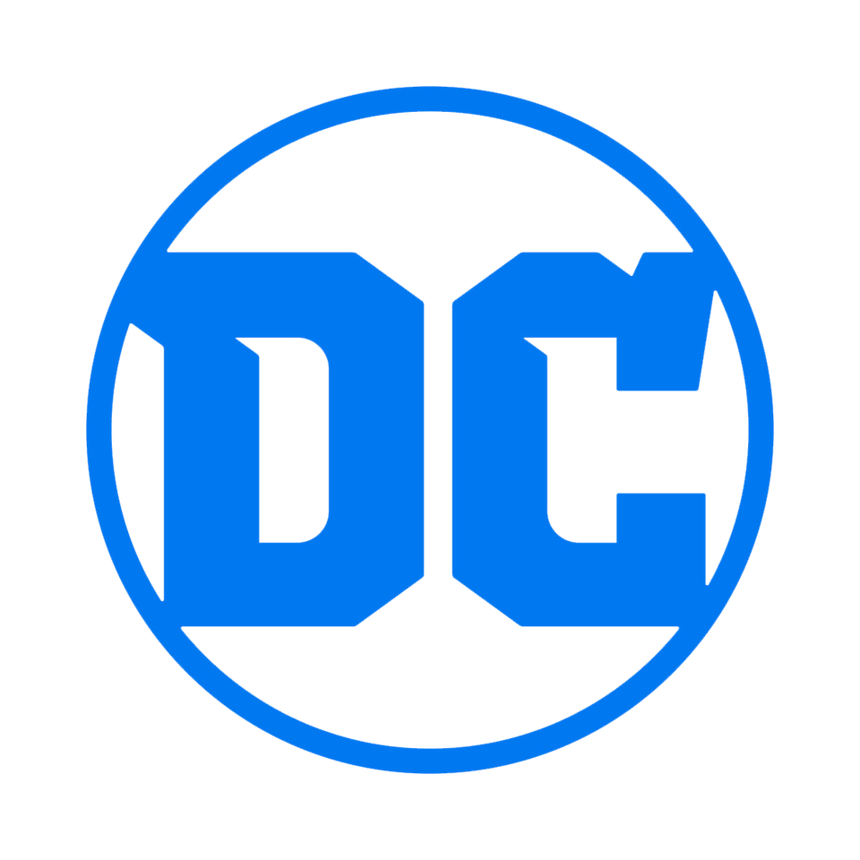
The launch of the new logo is the perfect tribute to DC’s legacy, exciting future and most importantly, our fans.
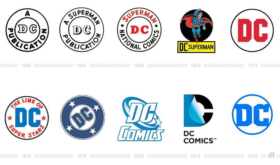
The storied history of the DC logo. Our goal was to bring back the best elements of the past and combine them with some serious future-facing $#!%.
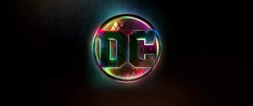
Here it is treated, in front of the most recent Suicide Squad TV spot.
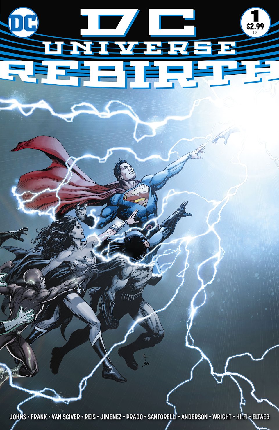
And here it is in its first appearance on a book. Lots more to come...